


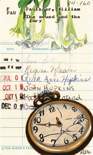
Visual artist Heidi Pitre was attending an artist residency in Navasota, Texas, in 2015 when she visited the local library with a list of books she wanted to read. “While perusing,” she says, “I noticed the [checkout] cards were still in the backs of the books, yet they were using an updated system in the front of the books.” She got permission from the librarian to take the cards, which sat on Pitre’s desk for weeks before she had the idea to draw on them. Noting that these were “fragile pieces of ephemera,” she says, “in the beginning, I strictly used pen and ink, then I slowly began adding small areas of color with watercolor.” As the project progressed, Pitre wanted to add more color, but too much water would be harmful to the checkout card material. “Gouache became my solution,” she says. “It gives the cards color and depth, without damaging them.”
Pitre’s cards tend to feature the classics: a tall, glowing beacon tower for Virginia Woolf’s To the Lighthouse, an old English estate for Emily Brontë’s Wuthering Heights, and a broken pocket watch (above) for William Faulkner’s The Sound and the Fury. Pitre precisely plans where the drawings will be placed in relation to the biographical material listed on the cards. The illustrations sometimes frame, and are sometimes layered over, due dates and the names of book borrowers. The resulting collage is delightfully analog in our digital era. “I’m a nostalgic,” Pitre says. “Therefore I often reminisce about yesteryear and the methods of the past.” She has now illustrated over a hundred fifty of these cards, which readers can view on her website, heidipitre.com/library-cards, and on her social media channels, @heidipitreart and @apermanentrecord.