


In the twenty-four years he's been designing book jackets, Chip Kidd has secured his rightful seat in the top tier of graphic designers in the country. His designs seem the perfect complement for the work of so many authors because, well, they're visually stunning, but also because he is one of them: The associate art director at Knopf, Kidd is also the author of two novels, The Learners (2008) and Cheese Monkeys (2001), both published by Scribner. Shortly after he returned from a recent trip to Dublin, where he headlined at one of the many design conferences to which he is invited, Kidd spoke about the cover he created for this issue.

Tell us the story behind the cover.
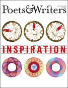
Before I was in Dublin I was in Istanbul, for the first time, which was rather a revelation. Basically, everybody's trying to sell you something. There are literally four thousand little shops and bazaars, and they're all selling about seven different kinds of things—for example, these rather old-looking...they look like they're illuminated manuscript pages from about three hundred years ago, a lot of them with really cool calligraphy. I found one with these whirling dervishes. I was with Sandy McClatchy, my boyfriend, and he was saying, "Well, you know, they're all about inspiration." I thought, "That's something to keep in mind." Then, a day later, we were walking down one of the busy streets and this kid—he must have been about twelve or thirteen—was set up with a little table off the sidewalk, and he was making Spirograph drawings. He was selling the Spirograph sets, which he had there, but he also had this stack of Spirograph drawings that he had made, and it instantly took me back to when I did that as a kid. And they were absolutely beautiful, and he was doing them in fluorescent pen colors, which were blending beautifully. So I was like, "Can I buy some of the drawings?" And he thought I was crazy. He didn't speak English—which was okay, we were still communicating—but he was sort of saying, "I'm selling the Spirograph sets; I'm just making samples to show what they do." And I said, "No, I want to buy these," and so I bought five of them and for something like one lira apiece. And so I bought these things for nothing and it sort of jelled in my head—whirling dervishes and Spirographs. It just seemed predestined somehow.
Those are his Spirographs on the cover?
Sure they are. So that was my inspiration. And I love the sort of Then and Now: ornate in the baroque style and then ornate in the modernist style.
Do you enjoy doing magazine covers?
I get very little magazine work. I'm mainly seen as a book-jacket person. My most high-profile magazine project was two years ago, when I did a trio of covers for Rolling Stone for its fortieth anniversary. And that was almost too good to be true. I had my reservations about what I was going to be able to do creatively, but actually [editor and publisher] Jann Wenner was totally into it. I really abstracted the logo and blew it up so it's just the R and the O. I was able to work with materials that I couldn't work with on a book jacket. You know, it's rock and roll, so I went with prismatic foils and all this kind of over-the-top stuff, which for them was perfectly appropriate. The trick was to not make it look so gaudy that it was cheap.
Have you been successful juggling your own writing with your work at Knopf?
I'm very lucky in that any writing I do I essentially do for fun. I don't rely on my writing to make a living but I have the utmost respect for people who do. That's really tough. I couldn't do it. My two novels took a combined fourteen years to write. And my advances were actually pretty decent. There's no way I'd want to live on that. For me, it's another creative outlet. It frustrates the hell out of me, but I do enjoy it and I think it helps me to grow as a creative person.
Kevin Larimer is the editor of Poets & Writers Magazine.
