


The poet gives us his essence," Virginia Woolf once wrote, "but prose takes the mold of mind and body." Roberto de Vicq de Cumptich, a designer who has worked as creative director for Random House and HarperCollins, pours the essence back into the molds of a host of writers, including Woolf, in portraits created entirely out of the letters of each individual's name. The images above, taken from Men of Letters and People of Substance, published this month by Godine, are among forty-two such portraits; in her preface to the book, Francine Prose—whose own image appears in the collection—describes de Vicq de Cumptich's
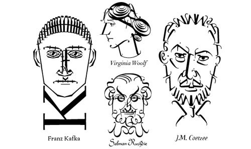
work as proof of how much can be accomplished with language. Along with each writer's name and portrait is listed the typeface used and the number of letters the designer used in his composition. (In Kafka's portrait, created using a typeface called Ruzena Antikva, he used the letter f thirty times.) "I tried to match the typefaces in two ways," writes de Vicq de Cumptich in his introduction, "the first to the style of writing and the second to a peculiar feature of their faces." For example, the Civilité typeface is used to make Rushdie's distinctive eyebrows recognizable in the portrait above. "A letter is much more than a representation of a symbol," de Vicq de Cumptich writes, "a letter depicts a time period, a certain mood and perhaps, in this book, the soul of the artist.
